Monopoly pricing: Examples using R
5.15 Simulating willingness to pay and considering ‘optimal pricing’
Remember, you can ‘hide the code’ with the ‘hide global’ button in the upper right of this screen.
Adapted from: Econometrics by Simulation
Note that the modern use of the term ‘Econometrics’ tends to refer to the analysis of real data, not simulated data.
Although this module is not about coding, you might find it insightful to consider how to use R code to calculate and graph and simulate the monopoly/pricing outcomes.
I hope this makes the theory a bit more concrete. It is obviously a great career and research skill to have some understanding of how to use computers to do simulations and to work with data.
If you can install R (and ideally RStudio), you might like to try to run the code yourself, and tweak certain parts to see how things change. R/Rstudio shoulda lso be installed on most university computers. If you just want to do a quick try, you can simply enter code into a hosted browser interface like the one below Hosted here… but Rstudio will be better in the long run.
Try entering some of the code into the box above and click the ‘run’ bar. A tip: to have R display any ‘object’ that has been defined, simply type it’s name on a line by itself.
Our monopolist is a broadband internet supplier within a city. Suppose for now that they only offer one bundle. For now we will consider a scenario with 2000 potential consumers but this can be changed by altering the
npeepvariable.
For each of these consumers we generate a willingness to pay for broadband internet (internet). [We assume that the mean WTP is £45]… and we add an error term to this in order to simulate variation between consumers. To do this we use the
rnormfunction which draws a random sample from the standard normal distribution (mean 0, variance 1) multiplied by £15. This yields a standard deviation of roughly £15.
A normal distribution follows the traditional “bell shape”. Perhaps it’s reasonable to assume that willingness to pay is normally distributed, but other distributions might also be possible, such as a “power law” distribution, with much longer “tails” then the normal distribution.
Some have claimed (but there is disagreement)%20exponent) that wealth follows a "power law’ distribution, suggesting wtp might do so as well.
npeep <- 2000 # Number of potential consumers

wtp <- 45 + rnorm(npeep)*15 # Each person has a different willingness to pay
Checking, the standard deviation is 14.66 (coded as sd(wtp)). The exact number will vary each time you run the simulation in R but it will generally be close to 15.
To figure out the demand curve we count the number of people willing to pay at least as much as the offering price.
We set the maximum offered price to 90, thus we consider prices between 0 and 90. From this we sum the number of consumers who have a willingness to pay above the offering price in order to give us a vector of quantity demanded at each price level.
maxop <- 90 # Max offering price
op <- 0:maxop # Offering price ranges from 0 to maxop i.e 0,1, ... 90

qd <- rep(NA,length(op)) # Empty vector for quantity demanded
for (i in 1:length(op)) qd[i] <- sum(wtp>=op[i]) # We fill qd with the number of consumers with a wtp >= offering price
Let’s look at the ‘vector of quantities demanded’
1997, 1997, 1997, 1996, 1995, 1995, 1995, 1993, 1989, 1987, 1985, 1981, 1979, 1977, 1974, 1969, 1962, 1951, 1942, 1929, 1913, 1900, 1888, 1873, 1859, 1841, 1821, 1797, 1771, 1737, 1700, 1669, 1626, 1586, 1552, 1513, 1461, 1416, 1364, 1312, 1261, 1199, 1152, 1103, 1051, 1002, 964, 909, 860, 812, 754, 706, 657, 599, 547, 508, 473, 423, 378, 339, 308, 289, 262, 241, 211, 195, 171, 152, 131, 105, 90, 80, 66, 58, 50, 43, 34, 28, 24, 18, 15, 9, 8, 6, 5, 5, 4, 2, 2, 2, 1
The code above has simply created a vector that computes the quantity demanded at each of the 90 prices £1, £2, …, £90, given the simulated willinges to pay for the 2000 potential consumers.
We assume:
Marginal cost is increasing though this is not a necessity. For something like broadband services we might think that up to a point marginal costs might be decreasing since the cost of adding one more customer might be less than the cost of adding the previous customer.
In our simulation we assume \(MC = 0.01(q_d)\)
Now we plot quantity demanded as a function of price:
plot(qd, op, type="l", xlab="Quantity", ylab="Price,  Cost",
      main="Demand for Broadband Internet", lwd=2)
abline(h=0, lwd=2)
lines(qd, mc, col="red", lwd=2)
legend(1450, 75, legend=c("Demand curve", "Marginal Cost"), col=c("black", "red"), lty=1)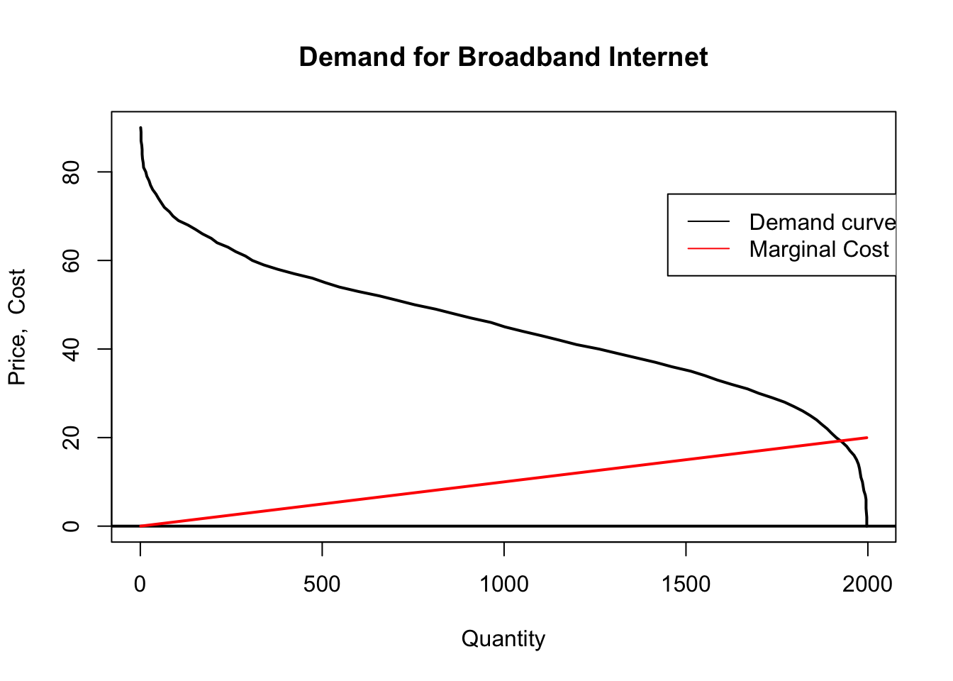
Above, we see that marginal cost only exceeds the “last consumer’s value” (thus the price that can be charged) … when output is around 1800 and the inverse demand (price that can be charged) and marginal cost meet at around 20.
The monopolist must choose a price in which to sell services at. If the monopolist chooses \(MC=P\) then the monopolist will not make any money but the consumers will be very happy. We know that the optimal point for the monopolist is at the point where marginal revenue curve intersects the marginal cost curve. Let’s see if we can find it.
Total cost just sums the marginal cost of all units; we generate this vertor for each of the quantities sold at the prices under consideration…
# Calculate total cost

qd.gain <- qd[-length(qd)]-qd[-1]
qd.gain[length(qd.gain)+1] <- qd.gain[length(qd.gain)]
for (i in 1:length(op)) tc[i] <- sum((mc*qd.gain)[length(qd):i])
Next we calculate total revenue and total profit … again for each element of the vector.
Next we plot total revenue and total profit against the considered prices.
minmax <- function(...) c(min(...),max(...)) # I think this function is simply used to define the plot scalre

#They use the traditional "plot" function. Ggplot  tools are much much better, and we will try to switch the code when we have a chance.

plot(minmax(op),minmax(tr,tp), type="n", ylab="Cost / Profit",
     xlab="Price",
     main="We can see optimal pricing for the monopolist is around £39:")

grid()
abline(h=0, lwd=2)
abline(v=39, col="red", lwd=2)
lines(op,tr, col="blue", lwd=3)
lines(op,tp, col="red", lwd=2)
legend(65, y = 45000, legend=c("Total revenue", "Total profit"), col=c("blue", "red"), lty=1, cex=0.72)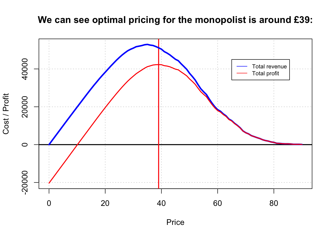
The monopolist calculates total revenue and total profit for each price.
We can see at the price around 18 which would be the optimal price for the consumer [recall that this is the result of marginal-cost pricing], the supplier is making almost no profits.
There are still some profits to be had here as with increasing marginal cost the average cost is less than the marginal cost.
On the other hand, the monopoly’s profit maximising price is around £39.
(Note that this is slightly higher than the total-revenue-maximizing price.)
The last thing we might wish to consider to Total Surplus or total system efficiency which is defined as that which the consumer benefits by purchasing a good below the consumers willingness to pay plus that of the suppliers profit at that price.
Technically we might want to consider what is called total surplus, summing consumer and producer surplus, which does not consider fixed costs. After fixed Costs are incurred they are “sunk” and thus not relevant for the social efficiency of the pricing decision.
.cs <- tr
for (i in 1:length(op)) cs[i] <- sum((wtp[wtp>=op[i]]-op[i]))
tts <- cs+tp
op[tts==max(tts)] # Check the optimal societal price## [1] 19plot(c(min(op),max(op)),c(min(cs,tp),max(cs,tp)), type="n",
main="How does surplus vary for different prices?",
xlab="Price",
ylab="Surplus")
lines(op, cs, col="purple", lwd=2)
lines(op, tp, col="blue", lwd=2)
lines(op, tts, lwd=2)
abline(h=0,col="red", lwd=2)
legend(60, 75000, legend=c("Consumer surplus", "Producer surplus", "Total surplus"), col=c("purple","blue","black"),lty=1)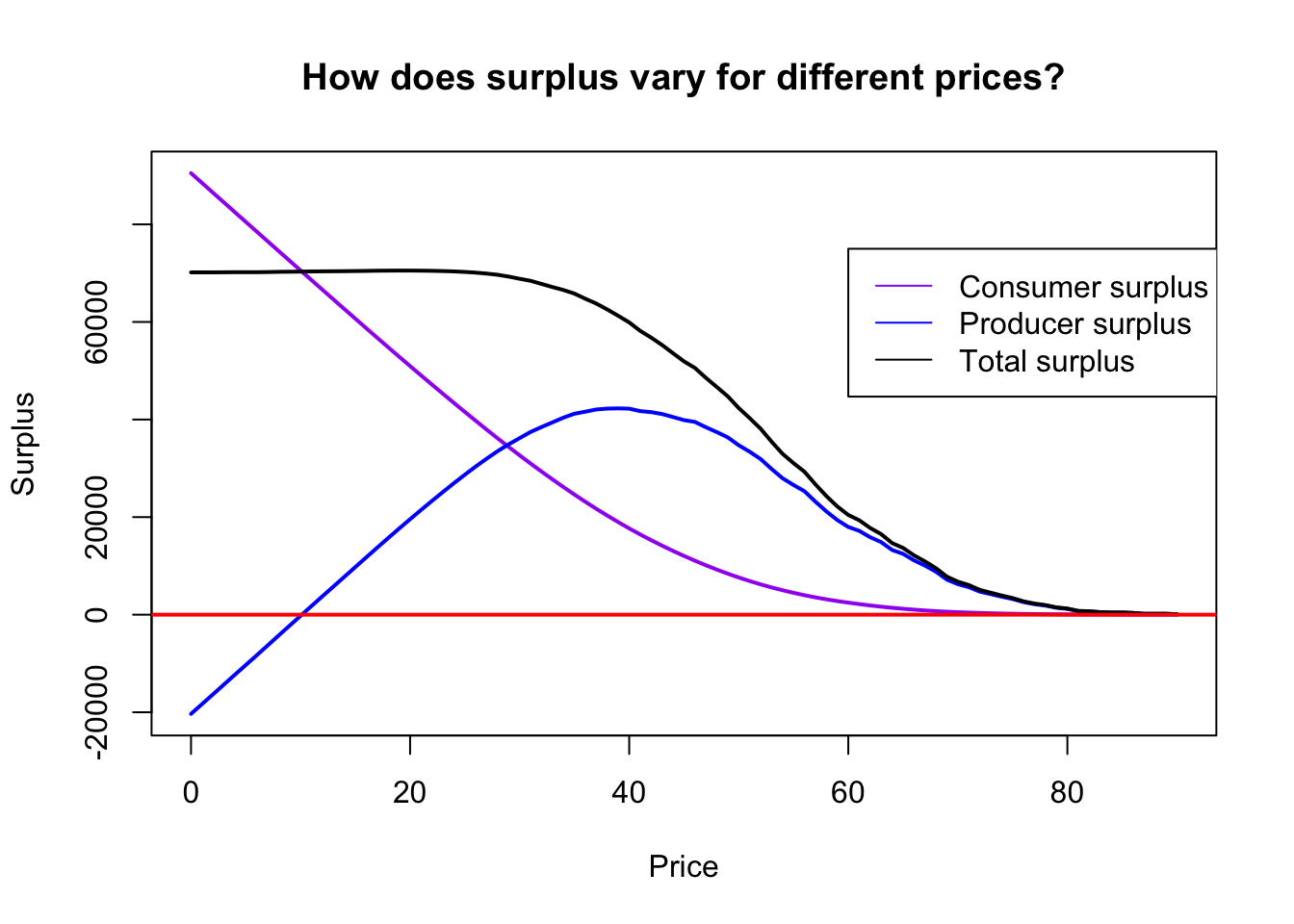
The peak of the total surplus curve is where where \(P = MC\), at about £19.
5.16 Estimating demand and optimal profit based on ‘historical data’ (presuming random firm ‘price experimentation’)
This blog and vignette (alternate link) appears to be an excellent marriage of microeconomic theory, data analysis and statistics, and business strategy.
Have a look: I hope to incorporate this further.