6 Analysis: Questions and tests
Rather than poetically characterizing our results, we try to keep the narrative short to let the data and statistical measures speak for themselves. The tests below follow from the questions asked and procedures proposed in our pregistration. We supplement this with Bayesian inference.
In the preregistration we say we will report “standard nonparametric statistical tests of the effect of this treatment on…”
6.1 Q: Does including impact information affect the propensity to donate?
Below, we consider the incidence rates each “steps on the ‘journey towards donating’” in response to the email.
Descriptives
We present the numbers and rates of incidence, comparing treatment and control recipients for 2018 and 2019, both separately and pooled.
Recall that the nature of the quantitative impact information differed between years. While the 2018 reported impact was highly overstated, the 2019 measure was based on calculations from GiveWell (albeit potentially outdated calculations).
(incidence_stats <-
  base_stats %>%
  as_tibble() %>%
mutate (
  conv_per_10k_recip = conv_per_recip*10000
) %>%
  dplyr::select(run, treatment, recipients, opens, clicks, conversions,conv_per_10k_recip,conv_per_click) %>%
  kable(digits=3) %>%
  kable_styling("striped", full_width = F) #as.tibble just to remove row label
)| run | treatment | recipients | opens | clicks | conversions | conv_per_10k_recip | conv_per_click |
|---|---|---|---|---|---|---|---|
| both | control | 131175 | 29047 | 681 | 74 | 5.641 | 0.109 |
| both | treat | 131173 | 28558 | 645 | 109 | 8.310 | 0.169 |
| 2018 | control | 91298 | 16906 | 414 | 27 | 2.957 | 0.065 |
| 2018 | treat | 91296 | 16195 | 371 | 71 | 7.777 | 0.191 |
| 2019 | control | 39877 | 12141 | 267 | 47 | 11.786 | 0.176 |
| 2019 | treat | 39877 | 12363 | 274 | 38 | 9.529 | 0.139 |
Above, ‘opens’ refers to the whether a recipient opened the email; this itself may have been impacted by the treatment.**
** While the ‘subject lines’ of treatment and control emails were identical, we cannot rule out that the individual email clients gave different previews of the emails prior to opening. Furthermore, spam filters may have dealt with the emails differently depending on minor differences in content.
‘Clicks’ refers to ‘whether a recipient clicked through from the email to the link within the email’ (the charity’s donation page).
‘Conversions’ (this term comes from nonprofit industry jargon) refers to the number of recipients who made donations.
conv_per_10k_recip: Conversions (donations) per 10,000 recipients of the email
conv_per_click: Conversions (donations) divided by the number of ‘email opens’ (or ‘clicks’).***
*** This is not a focal outcome, as clicks may also have been impacted by the treatment, as noted above.
* To do: add total donations/number of donations.
(incidence_stats_combo_19 <-  dv_link_sum %>%
    filter(run==2019) %>%
    mutate(
  conv_per_10k_recip = conv_per_recip*10000
)  %>%
      dplyr::select(run, treat_2018, treat_2019, recipients, opens, clicks, conversions, conv_per_10k_recip)
) %>%
    DT::datatable()  %>%
  formatRound(columns=c('conv_per_10k_recip'), digits=2)
To the naked eye, the 2019 conversion (donation incidence) rate is similar within 2019 treatments (Control or Test) while comparing across 2018 treatments (Control or Test). (The rate appears somewhat higher for those who were not present in 2018; these likely represent a new and perhaps more motivated group who joined the mailing list in 2019.)[Todo: add SE’s and or CI’s to this, and/or formal statistical tests?]
We also compare the 2018 donations across 2019 treatments; while causality can be ruled out, this could be seen as a check on the balance of the 2019 random treatment assignment.
(incidence_stats_combo_18 <-  dv_link_sum %>%
    filter(run==2018) %>%
    mutate(
  conv_per_10k_recip = conv_per_recip*10000
)  %>%
      dplyr::select(run, treat_2018, treat_2019, recipients, opens, clicks, conversions, conv_per_10k_recip)
) %>%
    DT::datatable()  %>%
  formatRound(columns=c('conv_per_10k_recip'), digits=2)
Binary outcomes, hypothesis tests and inference: Fisher’s exact test, confidence/credible intervals
We next run the Fisher’s exact statistical significance test for these binary outcomes, as pre-registered.*
* There is a reasonable argument [reference] that Fisher’s test is not appropriate for a case like this one, but for a situation with a known rate of two types of outcomes (but an unknown distribution of these across treatment) as in the ‘lady tasting tea’ example. Other suggested tests are include the Bayesian test of differences in proportions, which we report below]. We chose Fisher’s exact test here by standard convention.
As noted in the preregistration: “We will report confidence intervals on our estimates, and make inferences on reasonable bounds on our effect, even if it is a ‘null effect’.” Thus, we present confidence intervals (as well as Bayesian credible intervals for differences in proportions below).
| Experiment | estimate | p.value | conf.low | conf.high |
|---|---|---|---|---|
| Opens, 2018 | 0.95 | 0.00 | 0.93 | 0.97 |
| Opens, 2019 | 1.03 | 0.09 | 1.00 | 1.06 |
| Opens, both years | 0.98 | 0.02 | 0.96 | 1.00 |
| Clicks, 2018 | 0.90 | 0.13 | 0.78 | 1.03 |
| Clicks, 2019 | 1.03 | 0.80 | 0.86 | 1.22 |
| Clicks, both years | 0.95 | 0.34 | 0.85 | 1.06 |
| Direct conversions, 2018 | 2.63 | 0.00 | 1.67 | 4.26 |
| All conversions, 2018 | 1.11 | 0.25 | 0.93 | 1.32 |
| Direct conversions, 2019 | 0.81 | 0.39 | 0.51 | 1.27 |
| Direct conversions, both years | 1.47 | 0.01 | 1.09 | 2.01 |
Opening rates
The estimates above report the relative risk ratio. The evidence suggests that the 2018 treatment had a negative effect on opening the emails, but the 2019 treatment had a positive effect on this (the pooled estimate is negative). These effects were likely small: confidence intervals exclude an effect of 10 percentage points or more in either direction (compared to an approximately 22% opening rate overall, see “key summary statistics and graphs”).
However, the overall estimates here may be dominated by the larger 2018 sample size. A multi-level model allowing heterogeneity may be warranted if we were to focus on the the ‘open rate’. Also note that the statistical significance of the 2019 effect is ‘marginal’ in a conventional NHST framework.
Click-through (from email to web site)
We consider the impact of the treatment on the rates at which individuals who recieved the email (whether they opened it or not), clicked through to the charity’s donation web page. Here the differences do not attain conventional level of statistical significance. Overall, the evidence suggests a small negative effect, but the confidence intervals are fairly wide.
Key outcome: Conversions
Finally, we consider the most interesting potential ‘effect’: whether the treatment led people to be more likely to donate something rather than nothing (referred to as a ‘conversion’).
The 2018 treatment seems to have had a strong positive effect on those donations coming from those who clicked on the link in the email itself. By this measure, the treatment increasing the conversion rate by 163% (point estimate), with 95% confidence bounds of +67% and +426%.
However, for 2018 we were also able to track the donations of those receiving these emails within the next period*, whether or not the donations came through the email link itself. Here we see somewhat of a backslide, with a point estimate of an 11% increase and confidence intervals ranging from -7% to +32%.
* This period was at least seven days and possibly substantially longer. The correspondence on this was not clear.
For 2019 we can consider only donations through email clicks; the charity did not share with us the remaining data. Here, the impact point estimate is negative, although the confidence intervals are wide, ranging from a -49% effect to a +27% effect. Pooling the two years suggests an overall positive (and statistically significant) effect (subject to caveats about pooling across distinct treatments).
We do not conduct formal tests for conditional measures such as ‘conversions per click’, as the differential selection problem makes such causal interpretation problematic. With richer data it might be worth considering bounds on these hurdle estimates (e.g., as in Lee (Lee 2009)).
Cross-year considerations and ‘clean’ analysis of 2019 data
In 2018 the information was unrealistically optimistic and it seems to have increased the incidence of giving, at least in the short run.
In 2019 the information was less optimistic and it seems to have had a less positive and even perhaps a negative impact.
Recalling the details (unfold)
We presented “somewhat unrealistic cost/impact information” (Treatment-2019: 20 USD to fully vaccinate and 200 USD to save a life) to people who were previously given either…
Control-2018: ‘no cost information’ or Treatment-2018: ‘very unrealistic cost/impact information’ “Last year, we were able to provide shelter, food, water, health care, education and human dignity to a family of 5 for a whole year for just $10”.
‘Crossing of treatments’
In all tests, it was a random split between control and test. CRS never shared exactly how they did it.
It was the same population that received the 2018 and 2019 emails.
There is thus, a full crossing of treatments. We were able to identify the pairings of treatment (i.e., who was in which treatment in which year) by matching identifiers. While we are not able to share this data or the code itself, we are sharing the summarized data used in our analyses (see previous descriptive section).
Unfortunately, we did not consider this issue in our preregistration.
Responses/considerations
Why should this possible interaction matter? Obviously, it only impacts the 2019 results, but that year had an arguably more realistic and meaningful information in the treatment. Considering the impact of the 2019 treatment, we can consider:
What could be the impact of the 2018 treatment on the response to the 2019 treatment?
Some theories on why it might matter and how to interpret it (unfold):
Possibilities:
The 2018 treatment made helping people seem so cheap that it made the 2019 treatment seem too costly in comparison, and thus ineffective (“if we can take care of a family for a year for 10 USD, why does it cost 20 USD for a single vaccine?”)
The 2018 treatment made the 2019 cost information less impactful, in either direction, because recipients grew accustomed to it.
The 2018 cost information was so unrealistic that it made people treat the 2019 information with a lot more skepticism.
Thus, our leading hypothesis is that the 2018 treatment either reduced the impact of the 2019 treatment towards zero, or made it more negative. But we cannot be sure.
We could also argue that this context is approximately ‘ecologically valid’ – people coming into the 2019 treatments had already been given some unrealistic cost information, or no information at all. This resembles people in the real world, who are often exposed to such overstatements.
Nonetheless, as we are able to track the pairings of treatments, we can present an arguably ‘cleaner’ series of results for 2019, focusing on participants who did not get the 2018 impact treatment. To the extent that these results agree with our preregistered ‘main’ results, this can be seen as further support.*
*We will also take an exploratory look at the ‘interaction’ effects, i.e., whether the 2019 treatment effect seems to differ depending on the 2018 treatment. (However, this should be seen as merely suggestive; this was not preregistered, and there are some important difficulties in identifying such interaction effects in the presence of nonlinear response functions, such as those involving ceiling and floor effects.)
| Experiment | Control obs | estimate | p.value | conf.low | conf.high |
|---|---|---|---|---|---|
| Opens | 42657 | 1.02 | 0.13 | 0.99 | 1.05 |
| Opens (no 2018 treat) | 26554 | 1.00 | 0.92 | 0.97 | 1.04 |
| Opens (2018 control) | 16043 | 1.02 | 0.44 | 0.97 | 1.07 |
| Clicks | 42657 | 1.01 | 0.97 | 0.85 | 1.19 |
| Clicks (no 2018 treat) | 26554 | 0.98 | 0.88 | 0.81 | 1.20 |
| Clicks (2018 control) | 16043 | 0.87 | 0.38 | 0.64 | 1.17 |
| Conversions | 42657 | 0.72 | 0.12 | 0.47 | 1.11 |
| Conversions (no 2018 treat) | 26554 | 0.70 | 0.21 | 0.41 | 1.19 |
| Conversions (2018 control) | 16043 | 0.58 | 0.20 | 0.25 | 1.28 |
For the key outcome (conversions), we see a very similar estimate whether or not we include those in the 2018 treatment group. This suggests that the interaction of these treatments was at most small.
If we limit our observation to those in the 2018 control group we see a markedly more negative estimate. However, this is not an apples-to-apples comparison. The overall sample in 2019 is presumably selected to include those who tended to be more generous in 2018; thus they remained on the mailing list. The results here suggests that this subset may have responded more negatively to the 2019 treatment; however, the confidence intervals are extremely wide.
Focal: Bayesian Test of Difference in Proportions
Discussion and test details
Although we did not explicitly preregister this test, we are now emphasizing a Bayesian approach. This seems a particularly appropriate approach to establishing reasonable ‘near-zero bounds on the true magnitude of any effect’, and integrating this into a meta-analysis.
Unfold: details of this test…
This is a simple Bayesian test, comparing the ‘difference in proportions’ of a particular outcome between two groups. Below, \(\theta_1\) and \(\theta_2\) represent the true share of positive outcomes (‘conversions’) in the population if they were given the ‘control’ and if they were given the ‘treatment’, respectively. This follows on work by Andrew Gelman and Bob Carpenter (references HERE and HERE).
It returns a list of:
- (1 million) Differences in random draws of \(\theta_1\) and \(\theta_2\) from the two simulated posterior samples,
- the posterior probability that, for the true parameters, \(\theta_2 > \theta_1\) (derived from the above comparisons), and
- the credible intervals for these differences (sorting the differences in the simulated posterior samples and considering the probability masses).
The code also prints these results and produces a density plot of the differences.
DR: I think this is based on a 12-year old coding approach. Maybe we should update this to use STAN or something?
Further specific details…
Let \(y_{1}\) be the number of conversions in \(n_{1}\) (control) trials. \(y_{2}\) be the number of conversions in \(n_{2}\) (treatment) trials.
\(\theta_1\) and \(\theta_2\) are as described above.
We specify the prior and likelihood distributions
\[P(y_{1}|\theta_{1}) \sim Bin(n_{1},\theta_{1})\\ P(y_{2}|\theta_{2}) \sim Bin(n_{2},\theta_{2})\]
\[\pi(\theta_{1}) \sim Beta(1,1) \\ \pi(\theta_{2}) \sim Beta(1,1) \]
By Bayes Theorem: \[\begin{aligned} \pi(\theta_{1}|y_{1},{n_{1}}) &\propto \pi(\theta_{1}) \times P(y_{1}|\theta_{1}) \\ &\sim Beta(y_{1}+1, n_{1}-y_{1}+1) \end{aligned}\]
Similarly \[\pi(\theta_{2}|y_{2},{n_{2}}) \sim Beta(y_{2}+1, n_{2}-y_{2}+1)\]
For our (seemingly) more conservative measure we assign both \(\theta\) values ‘standard uniform’ priors (which are equivalent to \(\beta(1,1)\) priors) - this allows a closed-form analytical solution for the posterior. This means we give equal weight to all possible of each \(\theta\) might be before we observe the data. (This prior is very conservative; given previous evidence on charity campaigns, it seems very unlikely that conversion rates would be higher than, say, even 5 percent.)
In each case, we take one million samples from the posterior for \(\theta_{1}\) and one million samples from the posterior for \(\theta_{2}\). We do not plot the density of these samples; instead we focus on the differences. To find the probabilty that \(\theta_{2} > \theta_{1}\), we use the Monte Carlo approximation. This means that we compare each \(\theta_{1}^{i}\) with the corresponding \(\theta_{2}^{i}\) (i in 1:1 million samples), and count the share of which have \(\theta_{2} > \theta_{1}\). This gives us the value in the first table, the probability (in percent) that \(\theta_{2} > \theta_{1}\)
We also care about the distribution of the difference in the proportions; what does the distribution of the difference in the “true” proportion of conversions for the treatment and the “true” proportion of conversions for the control look like? Here we have a closed-form solution: Define \(\delta = \theta_{2} - \theta_{1}\). Then the posterior for \(\delta\) is simply the difference of two beta distributions.
However, because we already have one million samples of \(\theta_{2}\) and one million of \(\theta_{1}\), we can simply subtract \(\theta_{2}^{i}\) from the corresponding \(\theta_{1}^{i}\) to give us one million samples of \(\delta\). The code outputs density plots of the distribution of \(\delta\) for conversions (for each subset we are analyzing). The table gives the 95% credible intervals for this value of \(\delta\); these are then overlaid onto the density plots.
The Bayesian difference in proportions test, bayesian_test_me is defined in a shared github repo file ‘functions.R’
Calibrating an ‘informative but prior’ over (independent) donation probabilities
We consider a prior over the probability of contributing that approximately reflects the overall empirical frequency of donations, as well as some reasonable bounds on this. We consider only priors that use the same distribution for the treatment and control groups, and (at least for now) assumes these are independent. Thus, our prior is not ‘baking in a likely effect in either direction’.
We consider a Beta prior that is centered roughly at the observed conversion rate, but allows what seems like a reasonable amount of dispersion.
First, we give some calculations to get reasonable parameters for the beta distribution over the priors. We first try based on the observed mean and a guess at the variance of twice the mean squared:
#From: https://stats.stackexchange.com/questions/12232/calculating-the-parameters-of-a-beta-distribution-using-the-mean-and-variance

estBetaParams <- function(mu, var) {
  alpha <- ((1 - mu) / var - 1 / mu) * mu ^ 2
  beta <- alpha * (1 / mu - 1)
  return(params = list(alpha = alpha, beta = beta))
}


Mu <- sum(base_stats$conversions[base_stats$run=="both"])/sum(base_stats$recipients[base_stats$run=="both"])
Var <- (2*Mu)^2

(beta_params <- estBetaParams(Mu, Var))
$alpha [1] 0.2491281
$beta [1] 356.8998
This generates an alpha of about 0.249 and a beta of about 357.
Next, an approach using the prevalence package for an expert with a best guess equal to the observed mean incidence, and 80 percent confidence it’s between 1/3 of this and 3 times this…
p_load(prevalence)

beta_params_expert <- betaExpert(Mu, Mu/3, Mu*3, p = 0.80, method = "mode")
This generates an alpha of about 2.57 and a beta of about 2,245
Now let’s look at this density:
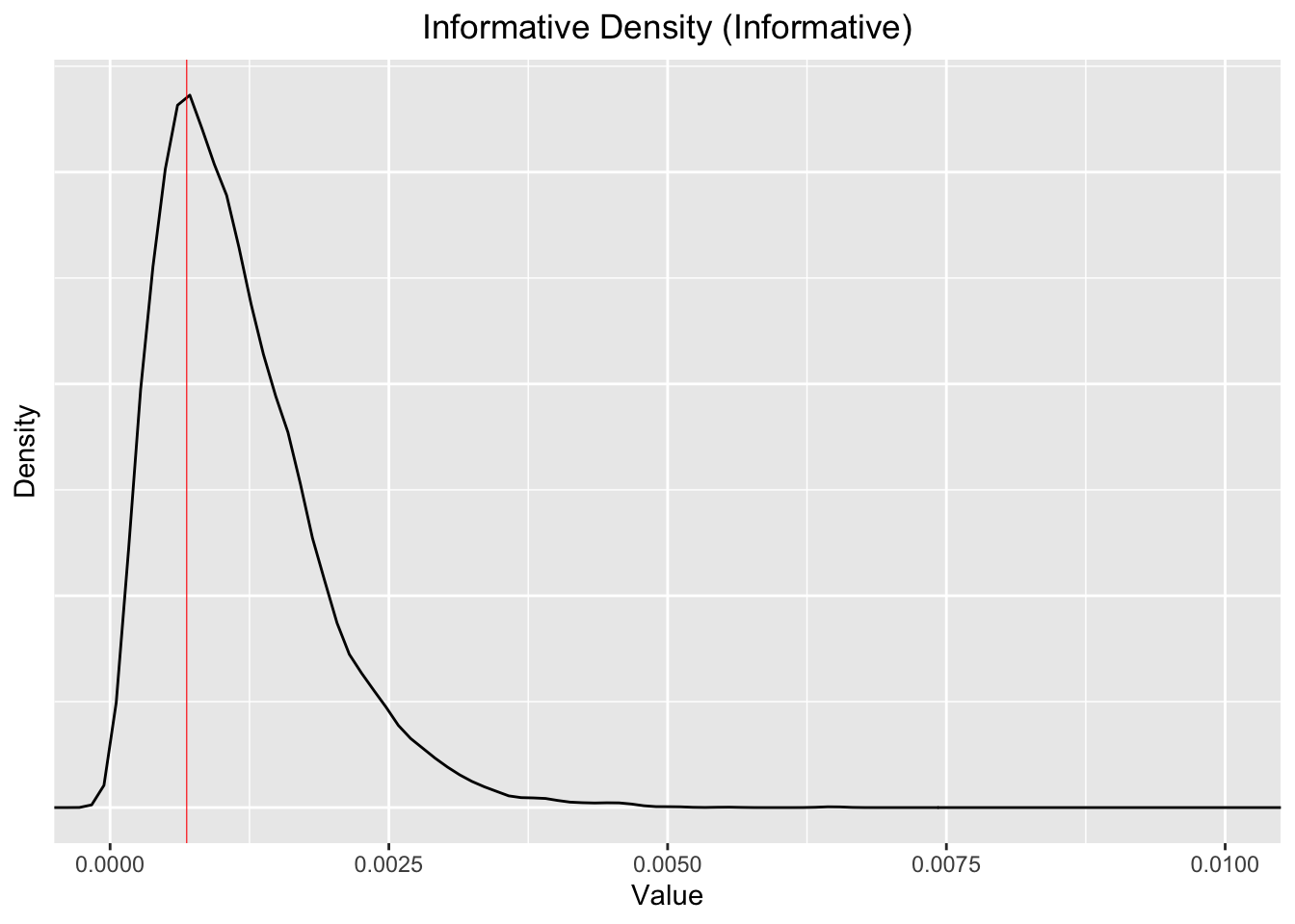
Note that the 99% percentiles (bottom and top) and the median for the for simulated “informative Beta distribution are”
Quantiles 0.01, 0.5, 0.99, as shares per ten thousand: 1.37, 10.1, 34.2. The mean is 11.5. So it’s centered a bit higher than the observed mean of 6.98 per 10k, but it’s fairly close.
This is still, arguably, somewhat conservative, given that the conversion rate we observe is generally less than 1 in 1000. We are allowing fairly substantial probabilities of much higher, and much lower conversion rates.
We can consider what this implies for the prior over the absolute and proportional differences in the incidence rates:
beta_inf_compare  <- data.frame(control= rbeta(10000, a_e, b_e), treat = rbeta(10000, a_e, b_e)) %>%
  as.tibble() %>%
  mutate(
  abs_dif = control-treat,
  scaled_dif = (control-treat)/mean(control)
)

beta_unif_compare  <- data.frame(control= rbeta(10000, 1, 1), treat = rbeta(10000, 1, 1)) %>%
  as.tibble() %>%
  mutate(
  abs_dif = control-treat,
  scaled_dif = (control-treat)/mean(control)
)


ggplot() +
  geom_density(aes(x=scaled_dif, fill = "Informed"), alpha=0.2, data=beta_inf_compare) +
  labs(title="Differences as share of mean incidence, comparing two densities") +
  geom_density(aes(x=scaled_dif, fill = "Uniform"), alpha=0.2, data=beta_unif_compare) +
  theme(plot.title=element_text(hjust=0.5)) +
   coord_cartesian(xlim=c(-5, 5)) +
    scale_fill_manual(name = "dataset", values = c(Informed = "red", Uniform = "green"))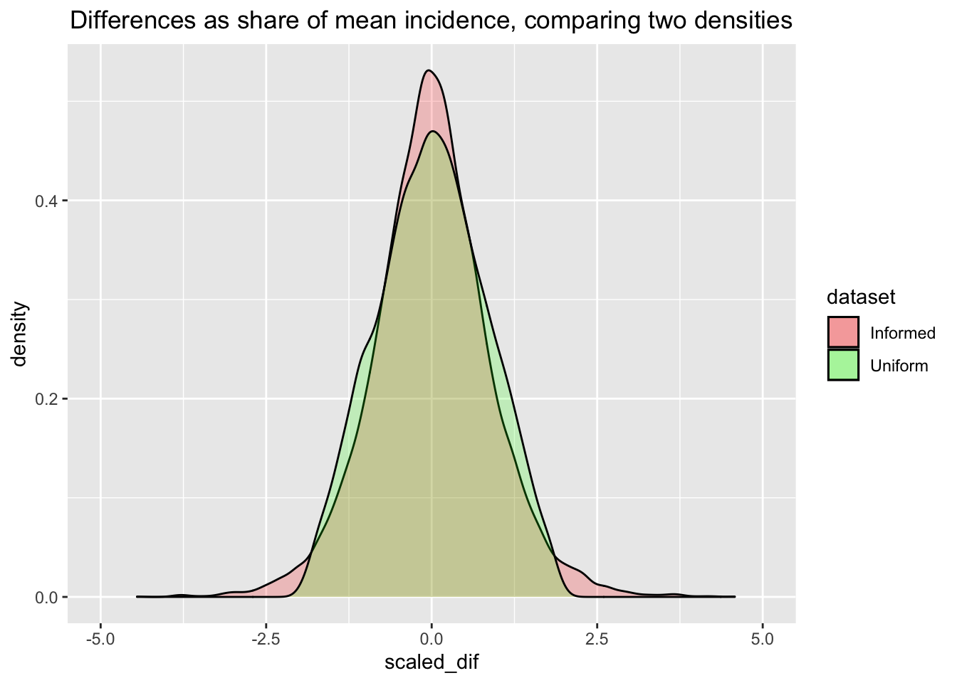
Next the ‘intensive Bayesian work’ … we sample from the posteriors for these two distinct priors. The time to run this, in seconds is given below:
ptm <- proc.time()

# Sampling from the posteriors, with differing values forms of priors:
priora  <- 1
priorb  <- 1

outcomes   <- bin_outcomes
yeargroups <- subsets

bayesUnif  <- newBayesFunction(priora, priorb, outcomes, yeargroups)
bayesInf   <- newBayesFunction(a_e, b_e, outcomes, yeargroups)

proc.time() -ptm
user system elapsed 10.196 0.143 10.401
# 17 Jan 2022 -- this took about 10-30 secondsComparison of Posterior Probabilities
The tables below give the estimated posterior probabilities that ‘the proportion of conversions in the treatment is greater than the proportion of conversions in the control’.
We first perform this test with the more conservative (Uniform) prior, yielding the following posterior probabilities for each of the differences in outcomes.
E.g., above, for 2019, there is about a 16-17% (posterior) probability that the treatment yields a higher rate of direct conversions than the control. Thus there is about an 83-84% chance that the control yields a higher rate of conversion than the control.
We then run it on the more informative prior. The results in the second column make it clear that this prior does not substantially change the posterior.
| Experiment | Prob. Treatment > Control (Uniform Prior) | Prob. Treatment > Control (Informative Prior) |
|---|---|---|
| Opens | 3e-04% | 0.0004% |
| Opens (no 2018 treat) | 96.2277% | 95.9529% |
| Opens (2018 control) | 0.7673% | 0.7503% |
| Clicks | 5.7813% | 6.061% |
| Clicks (no 2018 treat) | 63.8326% | 66.2638% |
| Clicks (2018 control) | 16.1017% | 16.1474% |
| Conversions | 99.9997% | 99.9994% |
| Conversions (no 2018 treat) | 87.5832% | 87.488% |
| Conversions (2018 control) | 16.5577% | 16.998% |
| NA | 99.5162% | 99.49% |
Distributional Plots
The following plots show the posterior density of the value for the difference in conversion rates per 10000 recipients, i.e., \(\delta = \theta_2 - \theta_1\), our treatment effect of interest. To put the magnitudes in context, the green dashed line gives the ‘base rate’ of average conversions per 10000 recipients.
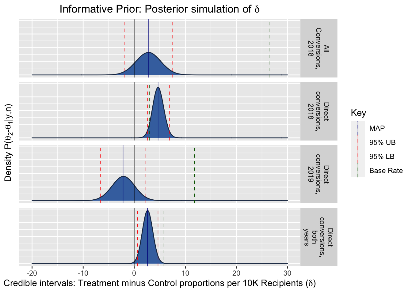
Comparison of MAPs, relative to the base rate
Maximum a Posteriori (MAP) estimates are the Bayesian analogy for the frequentist maximum likelihood estimates. They provide a point estimate for the most likely value of the parameter of the random variable (the coefficient of interest). (I.e., this is the mode of the posterior density.)
In the present case, this is the most likely value for the difference in the true parameters, i.e, our treatment effect: \(\delta = \theta_2 - \theta_1\).
The following table presents the MAP estimates, and shows them relative to the base rate.
| Experiment | Base rate (conv. per 10k) | MAP Estimate Per 10000, Uniform Prior | MAP Estimate Per 10000, Informative Prior | Uniform Prior Treatment Relative to Base Rate | Informative Prior Treatment Relative to Base Rate |
|---|---|---|---|---|---|
| Direct conversions, 2018 | 2.957 | 4.780 | 4.666 | 162% | 158% |
| All Conversions, 2018 | 26.397 | 2.784 | 2.826 | 11% | 11% |
| Direct conversions, 2019 | 11.786 | -2.261 | -2.182 | -19% | -19% |
| Direct conversions, both years | 5.641 | 2.632 | 2.608 | 47% | 46% |
Informative Prior: Credible Intervals
| Experiment | LB: 99% Credible Interval for ∂ | UB: 99% | LB: 95% | UB: 95% | LB: 90% | UB: 90% | LB: 80% | UB: 80% |
|---|---|---|---|---|---|---|---|---|
| Direct conversions, 2018 | 1.967 | 7.603 | 2.614 | 6.875 | 2.947 | 6.511 | 3.328 | 6.100 |
| All Conversions, 2018 | -3.443 | 9.034 | -1.957 | 7.530 | -1.198 | 6.760 | -0.320 | 5.880 |
| Direct conversions, 2019 | -8.033 | 3.670 | -6.590 | 2.263 | -5.853 | 1.550 | -5.023 | 0.735 |
| Direct conversions, both years | -0.006 | 5.317 | 0.622 | 4.654 | 0.941 | 4.322 | 1.313 | 3.942 |
Forest Plot Comparison
This graph shows the credible intervals compared between experiments; the blue dashed line depicts the base rate.
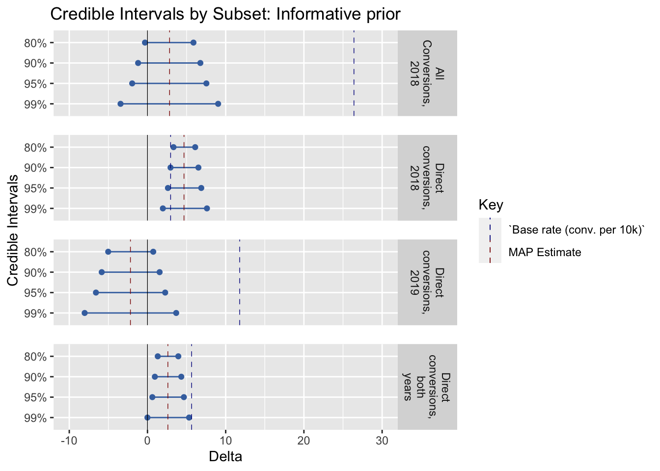
Possible future work: make this somehow automatically scale this relative to the mean response rate as part of the functional specification.
6.2 Q: Does including impact information affect the amount raised?
Preregistration: “Average gift amount (including zeroes)”
Descriptives*
* (Repeated from project overview, section: ‘Key summary statistics and graphs’)
dv_hist_email_stack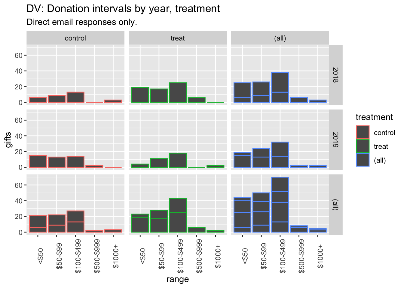
(
rev_stats_table <-  base_stats %>%
  as_tibble() %>%
  mutate (
    conv_per_10k_recip = conv_per_recip*10000
  ) %>%
  dplyr::select(run, treatment, rev_per_recip, av_pos_gift) %>%
  kable() %>%
  kable_styling("striped", full_width = F) #as.tibble just to remove row label
)| run | treatment | rev_per_recip | av_pos_gift |
|---|---|---|---|
| both | control | 0.1399200 | 248.02703 |
| both | treat | 0.0859399 | 103.42202 |
| 2018 | control | 0.1587768 | 536.88889 |
| 2018 | treat | 0.0703536 | 90.46479 |
| 2019 | control | 0.0967475 | 82.08511 |
| 2019 | treat | 0.1216240 | 127.63158 |
#TODO: other available measures (medians etc)Hypothesis tests and inference: Rank-sum and t-tests, confidence/credible intervals
“We will focus on… the standard rank sum and t-tests for the donation amounts.”
Prereg: “We will report confidence intervals on our estimates, and make inferences on reasonable bounds on our effect, even if it is a ‘null effect’.” \(\rightarrow\) Focus on confidence intervals and (Bayesian) credible intervals.
Rank sum tests
#Ranksum test - include zeroes
(
  dv_ranksum_18 <-  dv_ranks_all %>%
   filter(run==2018) %>%
   wilcox.test(rev_rank ~ treatment, data = ., exact = FALSE, conf.int=TRUE)
  )
    Wilcoxon rank sum test with
    continuity correction

data:  rev_rank by treatment
W = 4165562866, p-value =
0.000008781
alternative hypothesis: true location shift is not equal to 0
95 percent confidence interval:
 -0.00007985955  0.00006925308
sample estimates:
difference in location
        -0.00001984872
(
  dv_ranksum_19 <-  dv_ranks_all %>%
   filter(run==2019) %>%
   wilcox.test(rev_rank ~ treatment, data = ., exact = FALSE, conf.int=TRUE)
  )
    Wilcoxon rank sum test with
    continuity correction

data:  rev_rank by treatment
W = 795147158, p-value = 0.3116
alternative hypothesis: true location shift is not equal to 0
95 percent confidence interval:
 -0.00005859671  0.00006233042
sample estimates:
difference in location
         0.00006348472
#
#Ranksum test - CoP
Rank sum test for 2018 donations (including zeroes): p-value: 0.00000878114228243908
Rank sum test for 2019 donations (including zeroes): p-value: 0.311600645082915*
* To do: fix digits in p-values – the latter has five zeroes in front of it
6.4 Secondary: Email open rates, click-throughs
See preregistered ‘secondary analyses’
This was analysed above; see the table here and the discussion in the section Binary outcomes, hypothesis tests…
Further material below to be incorporated in